Client Work
Light Within Events
I turned a logo, an existing colour palette, and a collection of Instagram references into a clear, responsive website for a Budapest event-planning studio.
Next.js · TypeScript · Figma
Overview
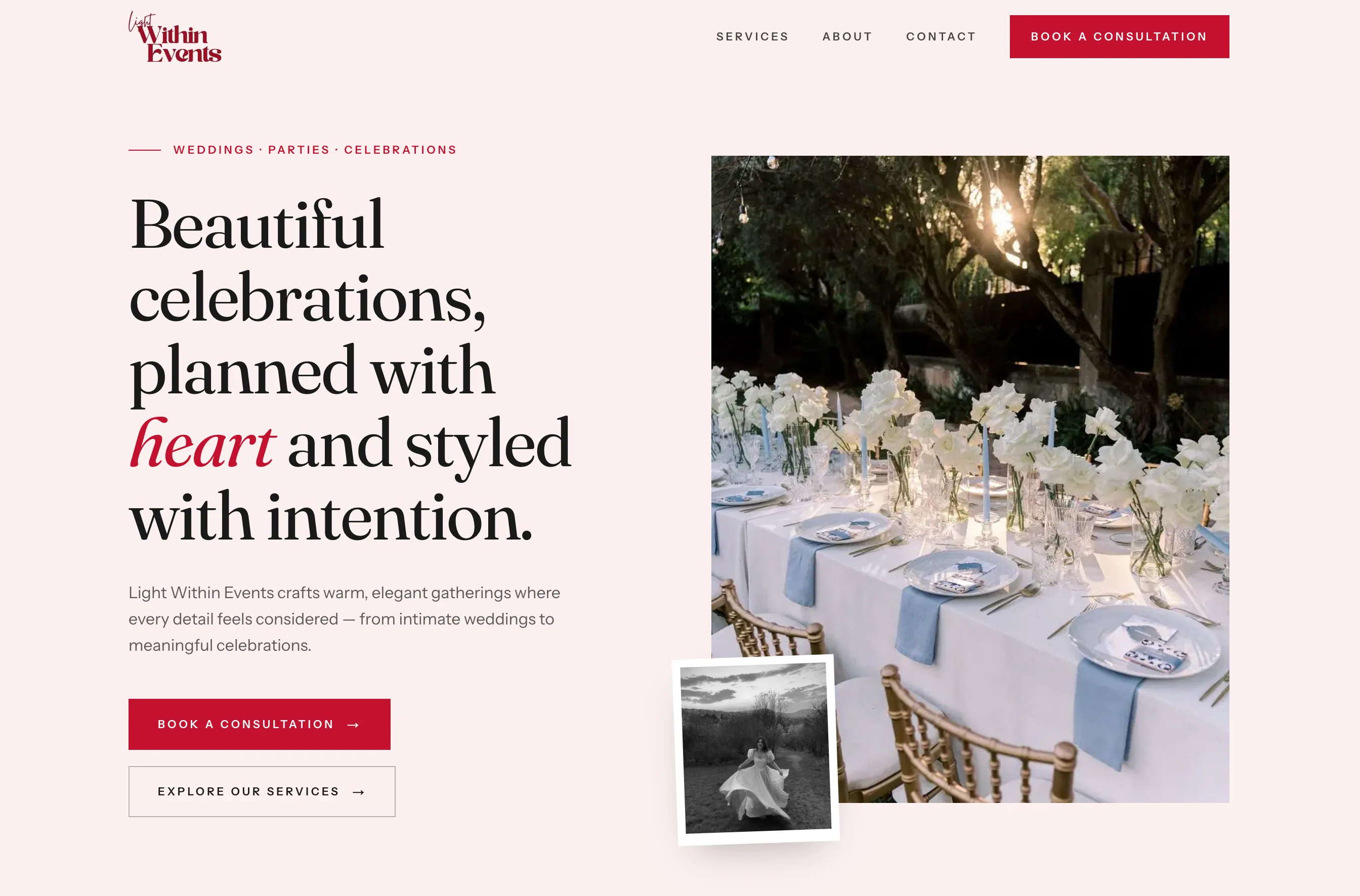
Light Within Events had an established mood, but no website or broader design system. The brand lived mainly through its logo, colour palette, and the founder’s Instagram references.
I designed and built a website that brings those pieces together, explains the studio’s services, introduces the people behind the business, and gives prospective clients a clear route to booking a consultation.
- Client
- Light Within Events
- Role
- Visual design and frontend development
- Tools
- Figma, Next.js, TypeScript
- Deliverables
- Visual system, responsive website, reusable component system
Starting point
The client knew how she wanted the business to feel: warm, romantic and personal.
What she did not yet have was a clear way to translate that feeling into pages, content, or a customer journey.
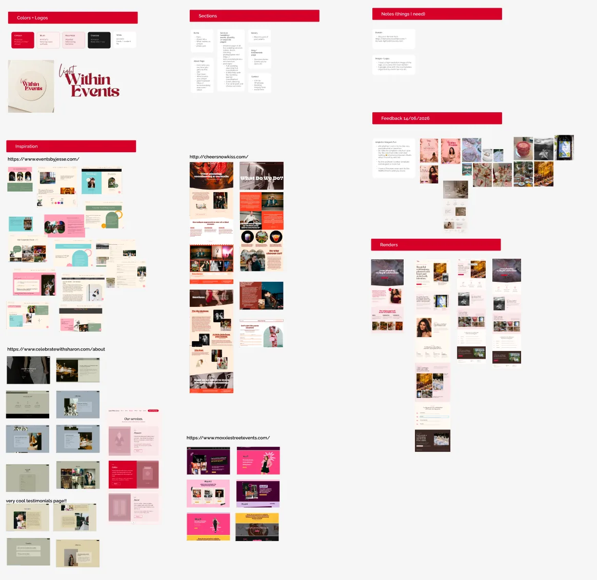
Most of the source material was visual. I worked from the existing logo, pink-and-red palette, event photography, illustrations, and examples collected from Instagram. From there, I had to determine what the website needed to say, how the services should be grouped, and how visitors would move from discovering the brand to making an enquiry.
Structure & exploration
I began by mapping the information the site needed: an introduction to the studio, an overview of its services, the founder’s story, examples of its visual style, the planning process, and a consultation offer.
In Figma, I tested several visual directions before settling on an editorial layout that could hold both practical information and expressive photography. The structure evolved through regular client feedback, particularly as we clarified which services belonged together and how prominently the founder and photographer should appear.
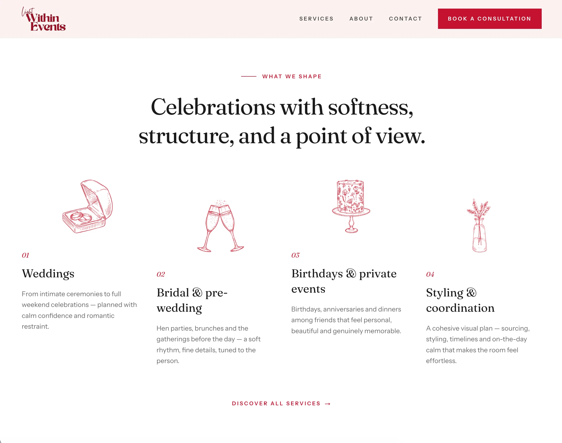
One important decision was to introduce the main event categories on the homepage, then reserve the services page for the fuller explanation. This lets visitors understand the offer quickly without forcing every detail into the first scroll.
Visual system
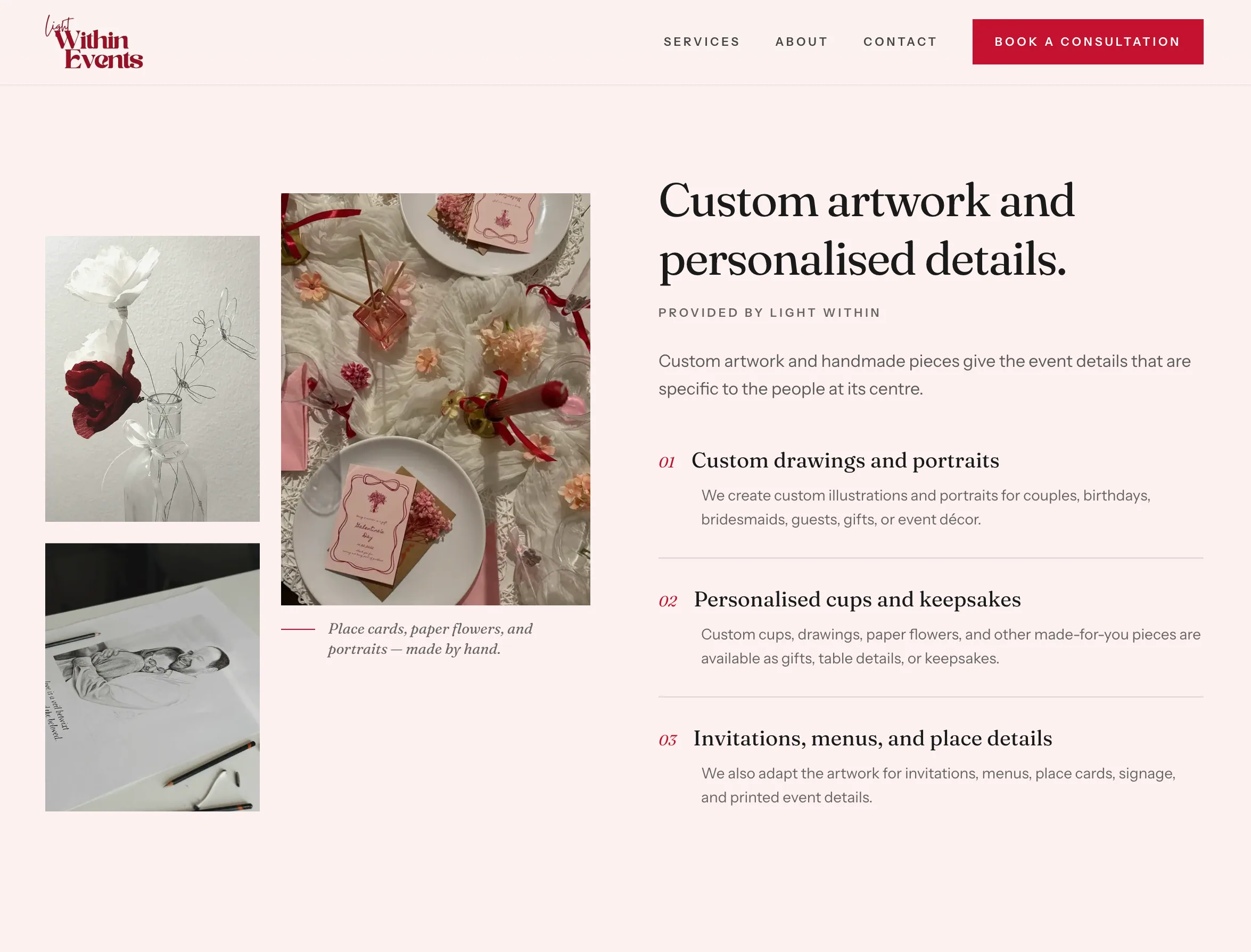
The design takes its cues from printed invitations and editorial magazines rather than a conventional service-business template. Large serif headlines establish the tone, while smaller sans-serif labels, numbering, and restrained rules give the pages structure.
I used the existing pink and crimson palette sparingly so it would feel recognisable without overwhelming the photography. Illustrations, candid event images, handwritten details, and asymmetrical image arrangements add personality, while the repeated typography and spacing keep the experience consistent from page to page.
The result is intentionally polished but not overly pristine. It leaves room for the slightly imperfect, personal details that distinguish the client’s work.
Responsive experience
On smaller screens, the editorial compositions become a simpler reading sequence. Images that overlap or sit beside the copy on desktop are stacked, decorative elements are reduced, and the essential heading, explanation, and next action appear first.
I also treated the mobile navigation and consultation page as working parts of the experience rather than compressed versions of the desktop layout. The consultation details, price, process, and booking button remain easy to scan without losing the visual character of the wider site.
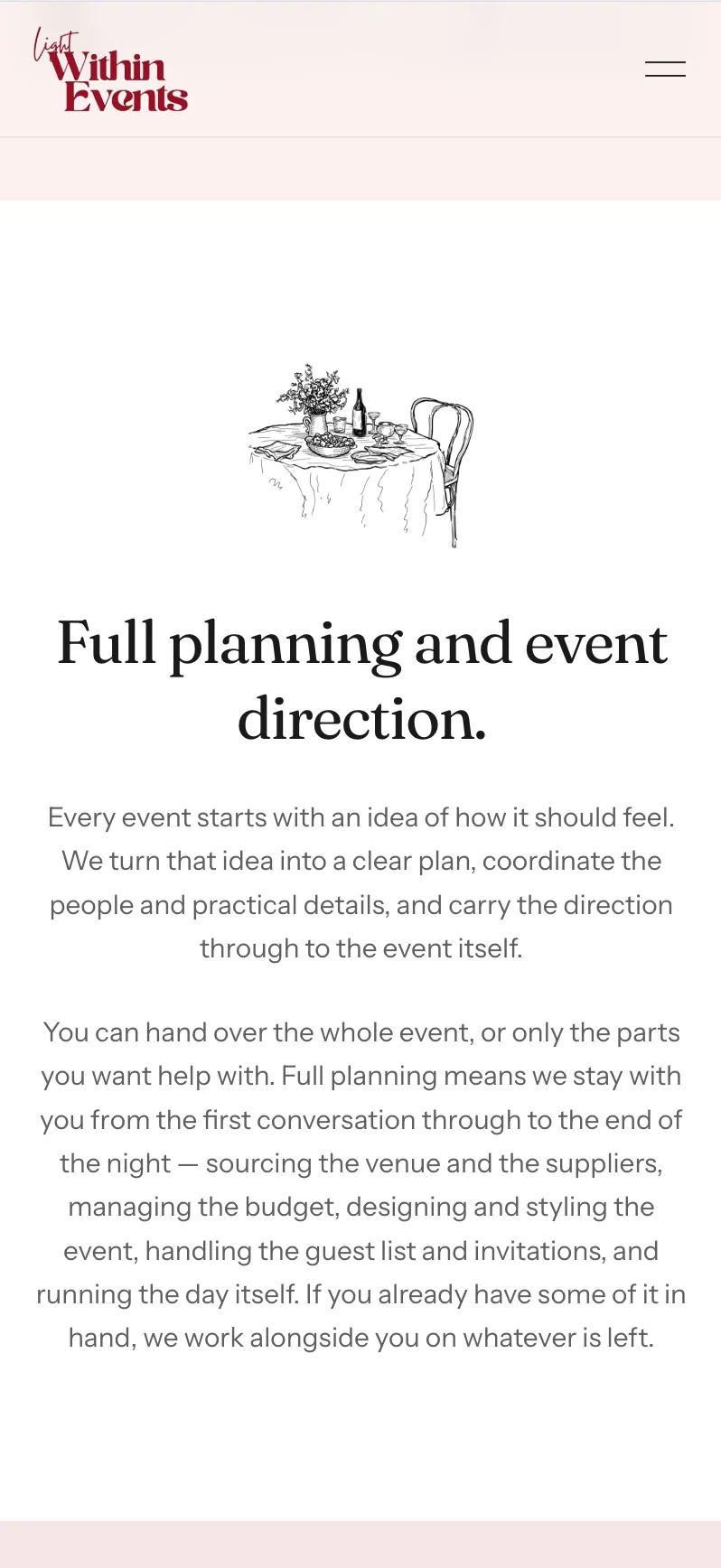
Desktop compositions reorganised into a clear single-column reading order. 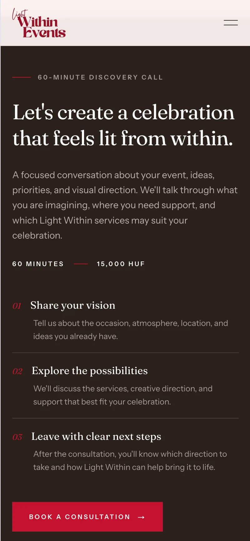
Consultation details kept together so the price, process, and booking action remain easy to find.
Building the website
Implementation
Once the direction was approved, I built the site in Next.js and TypeScript. I created reusable sections for recurring patterns such as service lists, editorial image-and-copy layouts, process steps, navigation, and calls to action.
The written content is separated from the presentation layer, making it easier to update service descriptions, consultation details, and bilingual content without rebuilding each page individually.
Accessibility & responsiveness
I also built the layouts to adapt at the component level rather than relying on one desktop composition that simply shrinks. Navigation works with a keyboard, images include descriptive alternative text, and motion is kept subtle so it supports the design without interrupting the content.
From first impression to enquiry
The page order follows the questions a prospective client is likely to have: What does the studio create? Who is behind it? What would working together involve? And what should I do next?
Brand impression
The opening establishes the studio’s location, visual tone, and type of work before asking the visitor to explore a service or book.
Services
Four concise categories provide an immediate overview, while the full services page explains the different levels of planning, styling, artwork, photography, and event support.
Founder & trust
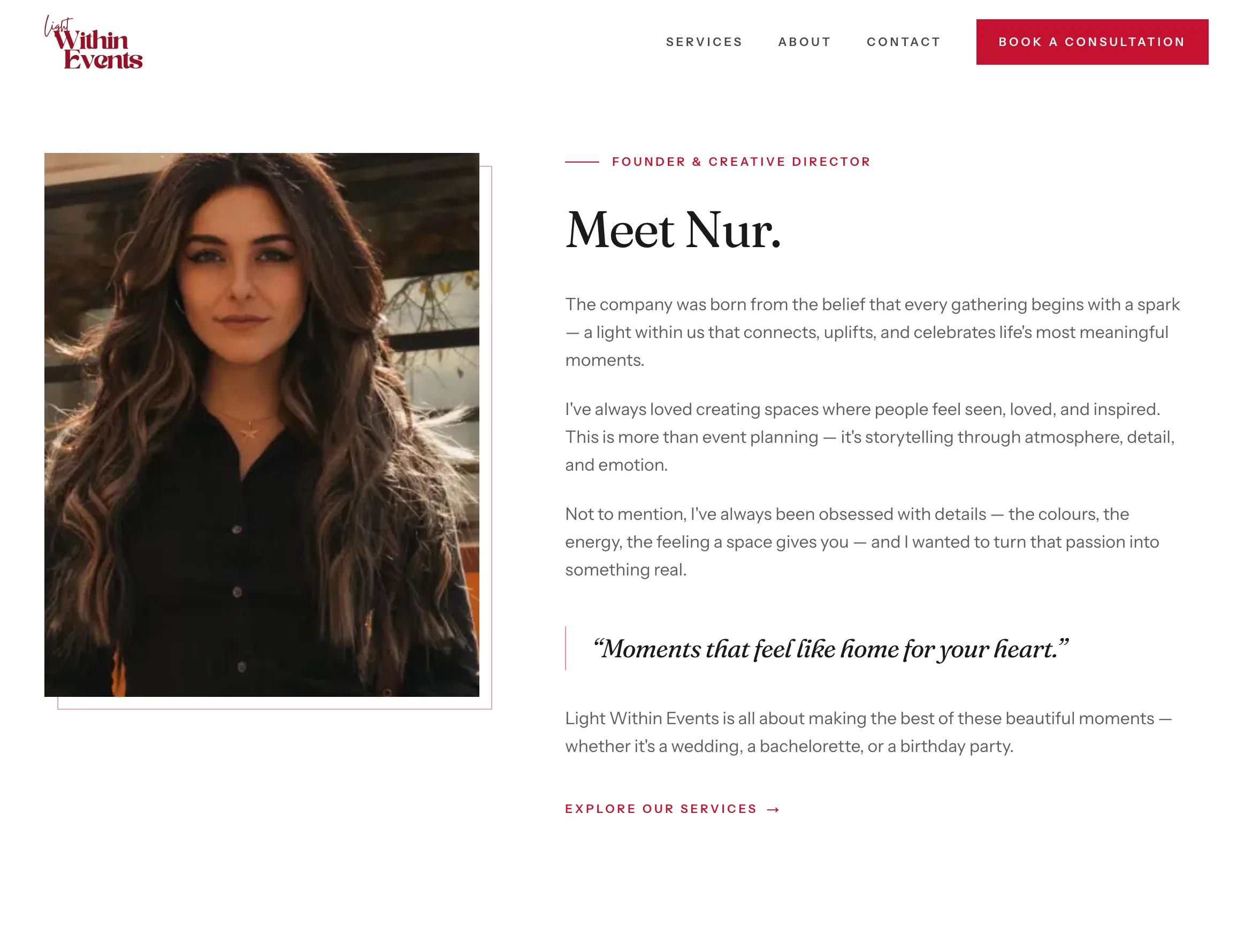
Introducing Nur early gives the business a face and makes the studio’s creative approach feel personal rather than anonymous.
Planning process
The process is reduced to four straightforward stages, from the first consultation through to coordination on the event day.
Consultation
The final section answers the practical questions (what the call includes, how long it lasts, what it costs, and what happens afterwards) before presenting the booking link.
Result
Light Within Events now has a website that feels recognisably its own and explains the business without flattening its personality.
Visitors can see the kinds of celebrations the studio works on, understand what support is available, meet the people behind it, and book a consultation from the same experience.
The project also pushed me to work beyond the interface itself. I had to turn informal references and evolving client ideas into a usable structure, make decisions with incomplete content, and build a system flexible enough to accommodate future service and language updates.